
After spending the summer and an unusually warm autumn wrapped in reliable white tank tops and black linen trousers, fashion enthusiasts everywhere are looking toward the colder months as an opportunity to inject fresh palettes into their daily wardrobes. According to industry insiders, the upcoming winter season offers the easiest entry point for color play, whether through a statement knit, a layered scarf, or an unexpected sock choice. To gauge the shifting landscape of seasonal hues, a recent internal debate among fashion editors revealed a striking consensus: while the runways are loud and clear about winter color trends, personal taste dictates a vastly different approach to what actually makes the cut.
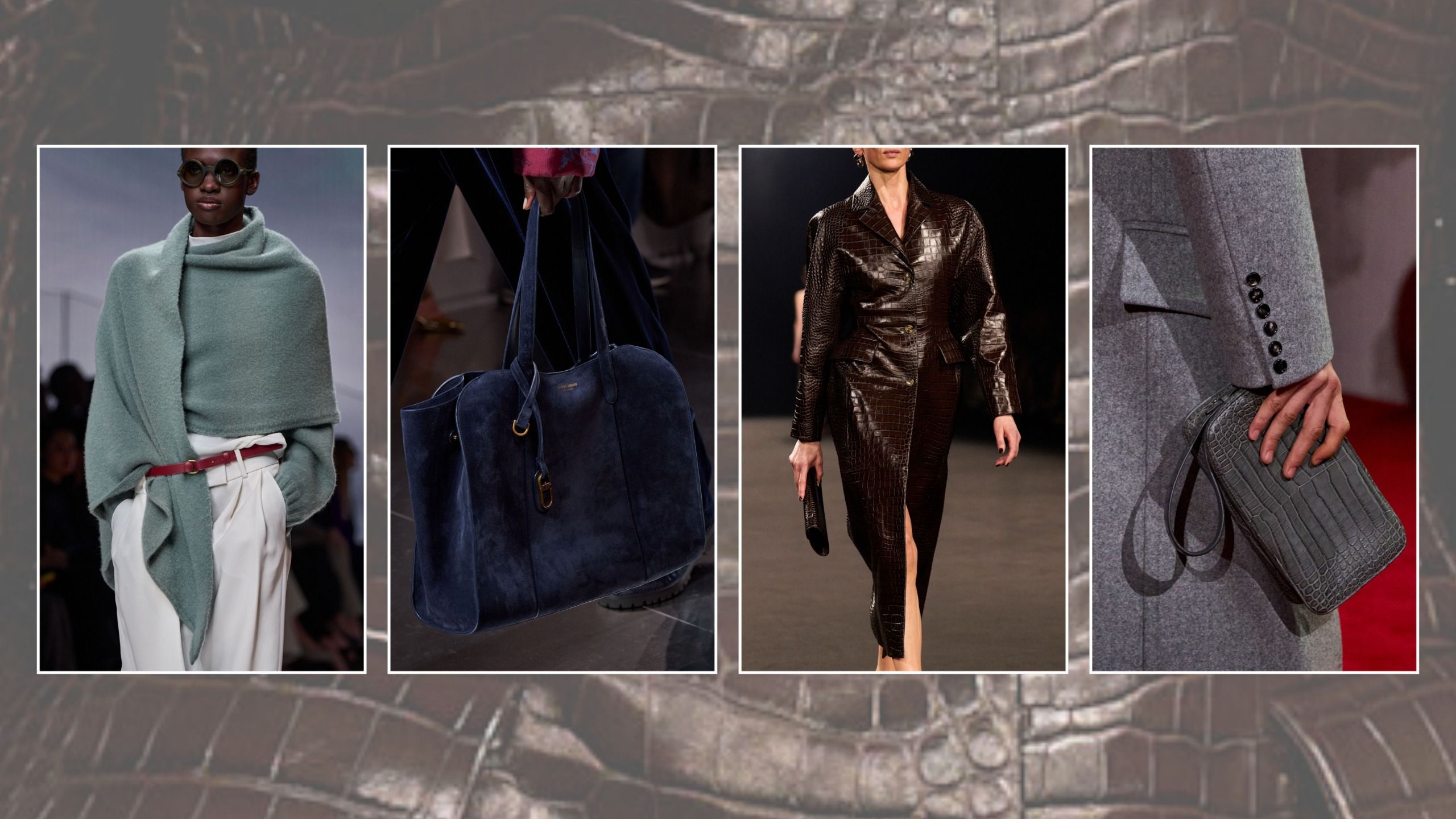
While fashion is inherently subjective and no shade is ever truly "dated" in a rigid sense, the autumn/winter 2026 runways have firmly established that color is doing the heavy lifting for cold-weather dressing this year. To unpack these shifting dynamics, prominent editors have weighed in on the hues they are actively embracing and the ones they are intentionally setting aside. Far from being a rigid prescription, these choices highlight how personal style and runway trends intersect as temperatures drop.
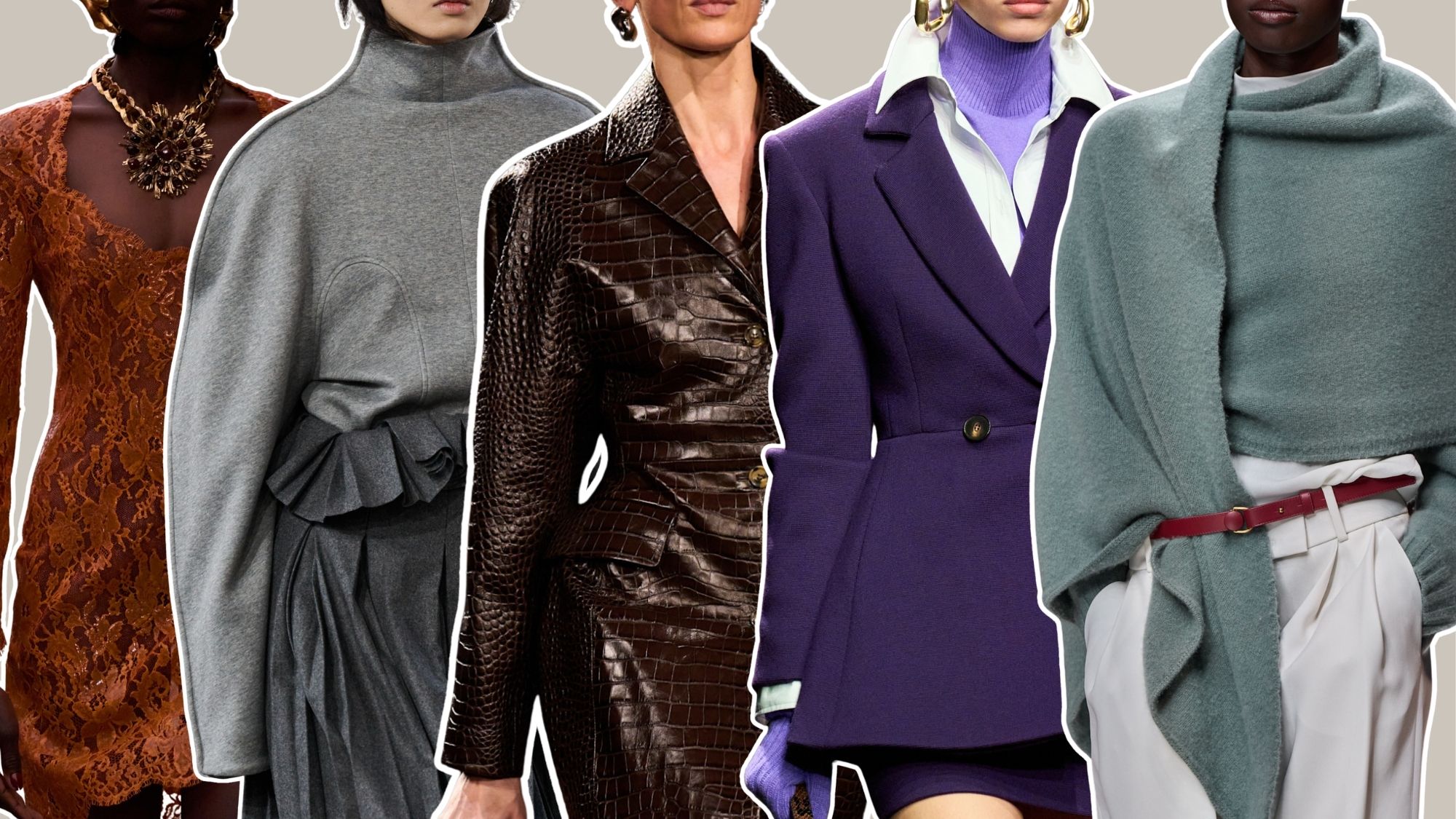
6 Colors That Feel "Dated" for Winter 2026, Plus 6 That Don’t
The debate over what stays and what goes in the winter wardrobe highlights a fascinating clash of minimalists and bold dressers. From cool, sophisticated neutrals to high-impact statements, the editorial team has mapped out a series of swaps designed to streamline morning outfit choices.
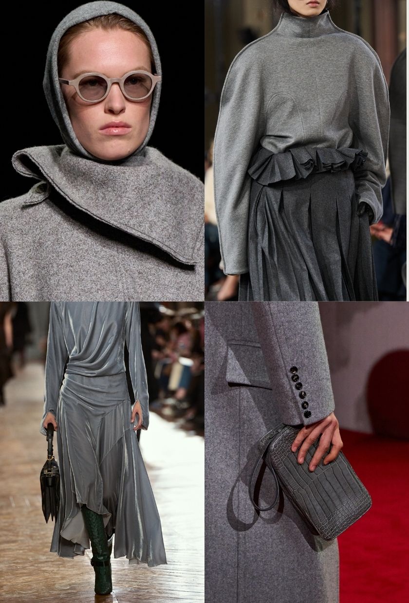
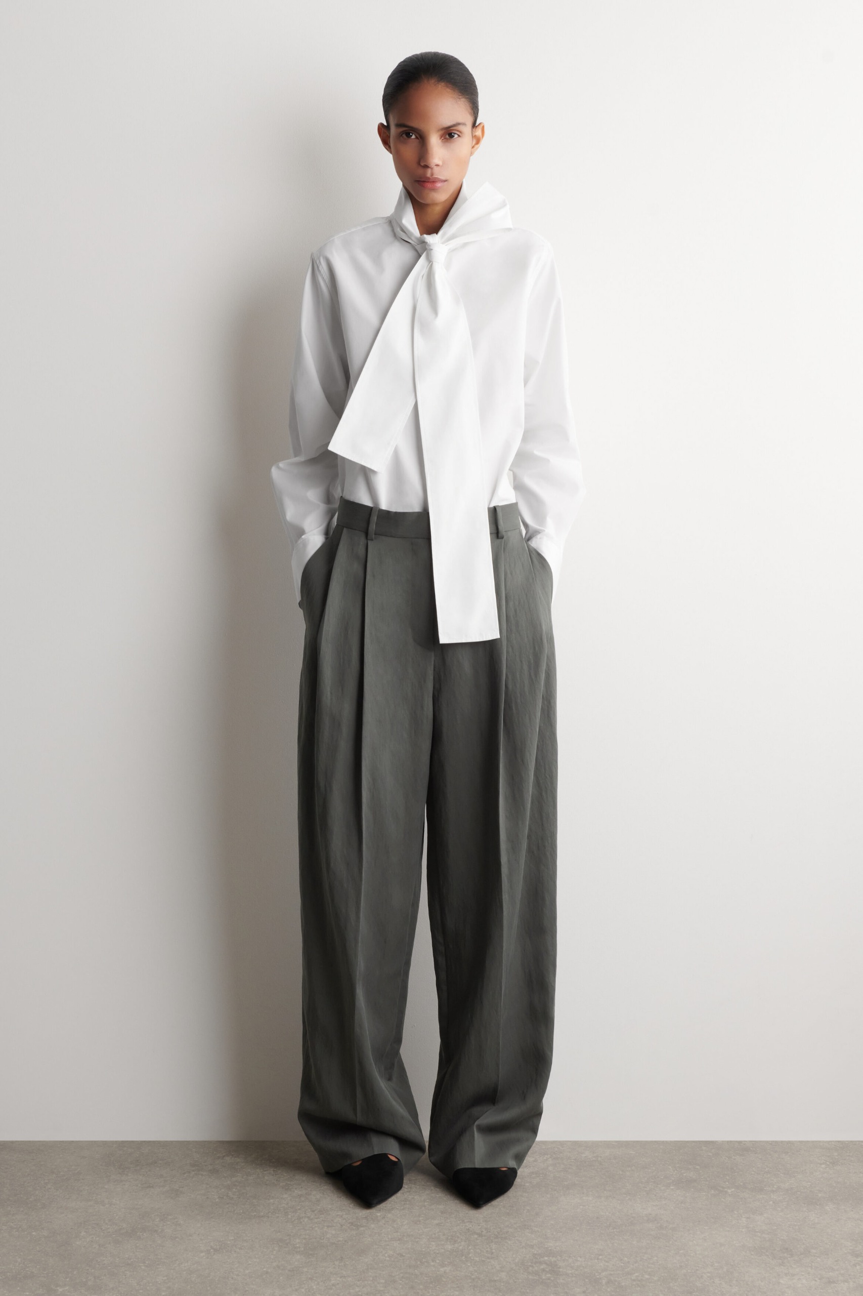
Wearing: Slate
Pausing: Teal
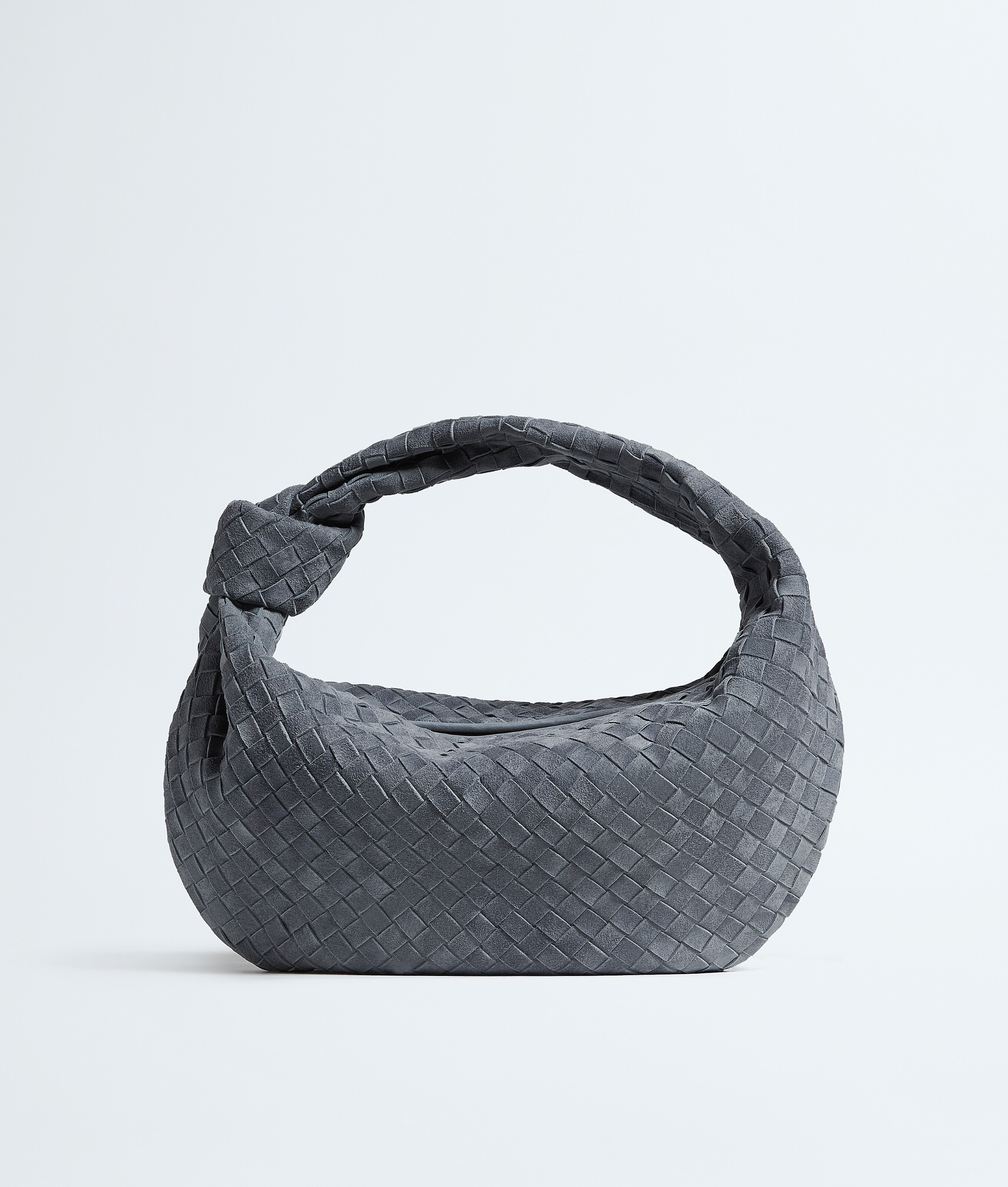
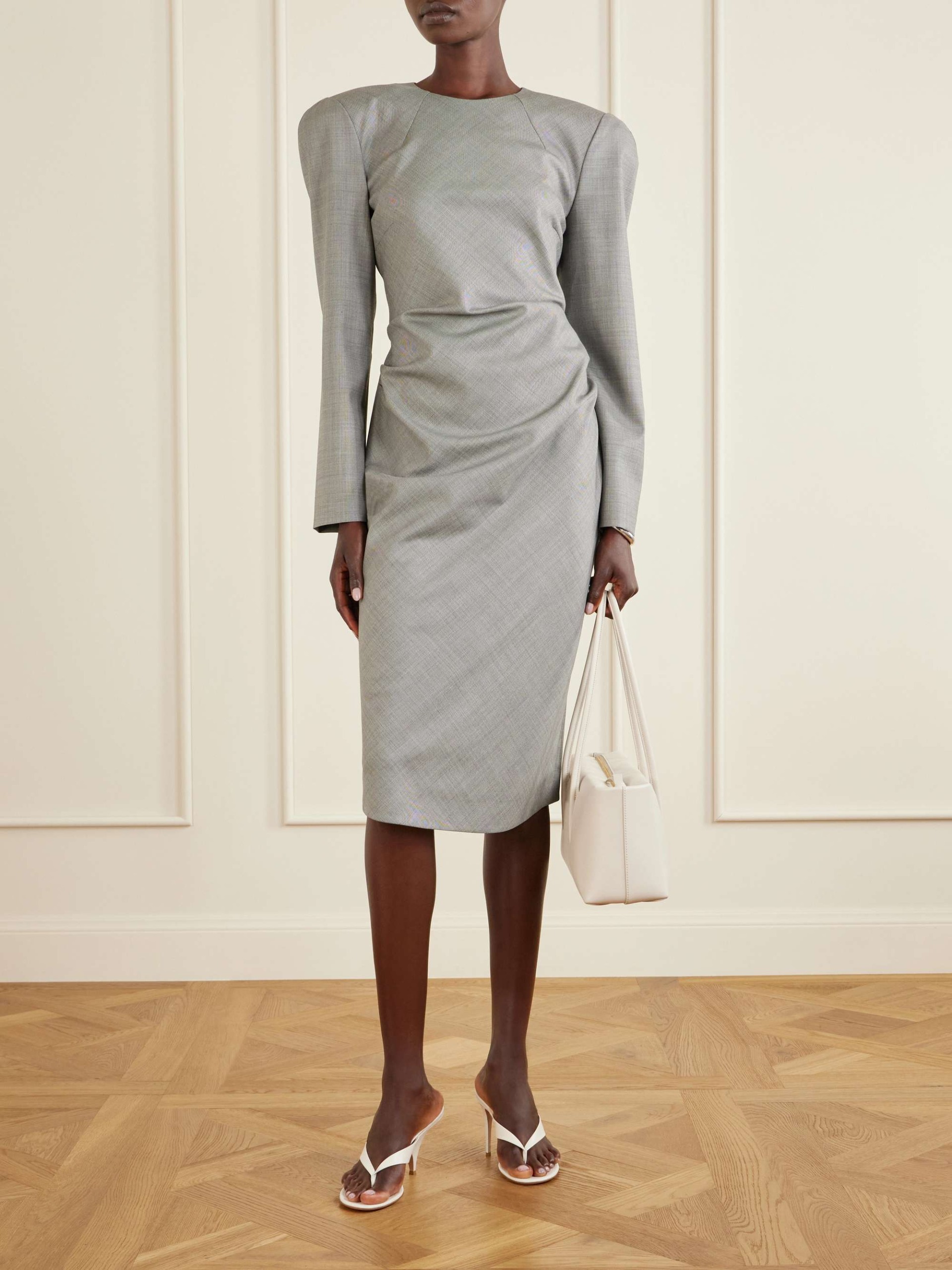
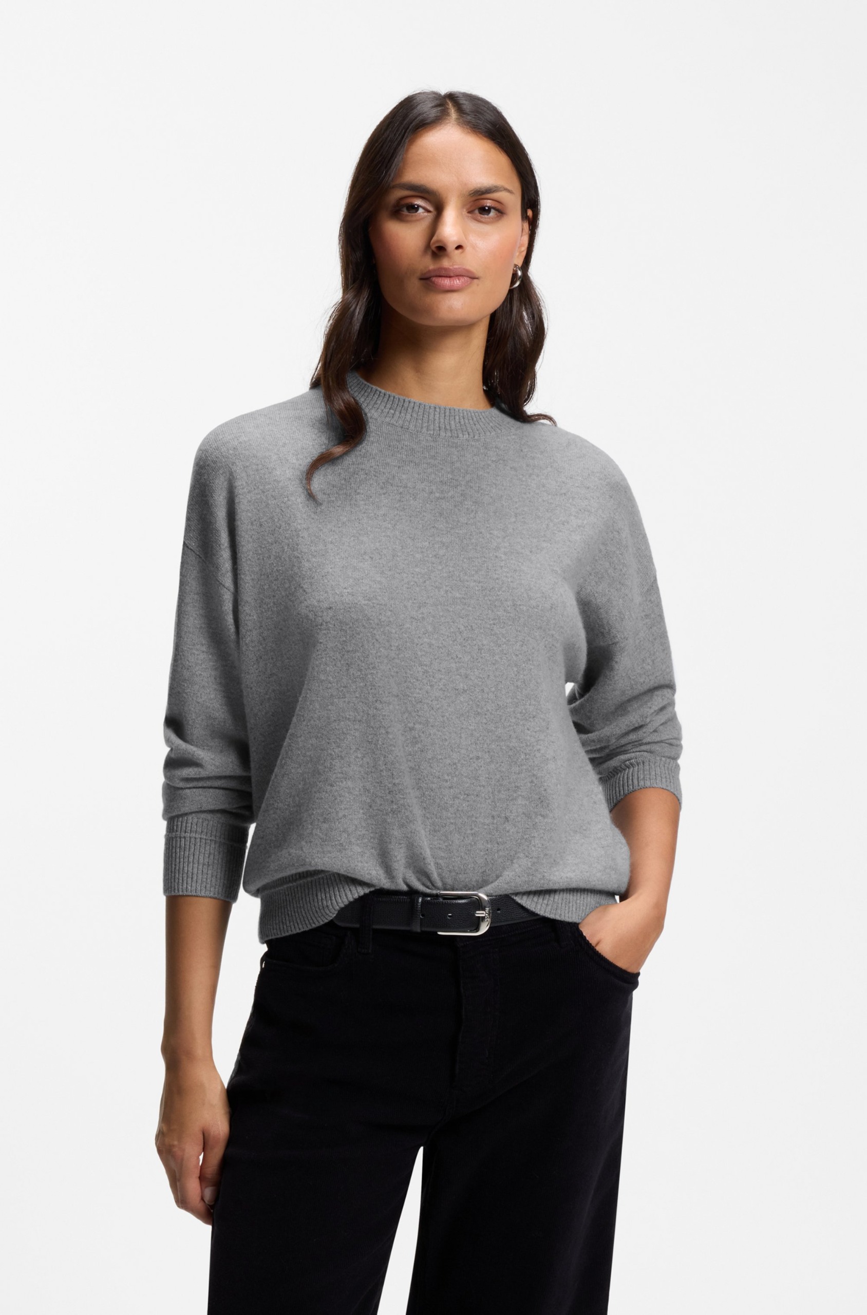
Transitioning away from the bright teals and turquoises that defined the summer months, junior fashion and beauty writer Brittany Davy is seeking a more mature aesthetic for winter. "I’ve loved the teals and turquoises that dominated this summer, but as winter comes around, I’m on the hunt for a shade that’s just a little more grown-up," Davy explains. Slate grey has emerged as her top contender, offering a polished yet cool sensibility for colder weather while maintaining the robust versatility of any traditional neutral hue. Backed by runway endorsements from major luxury houses like Bottega Veneta, Issey Miyake, and Lanvin, the shade paves the way for the ultimate monochromatic "groutfit" this season.
Wearing: Pumpkin
Pausing: Burgundy
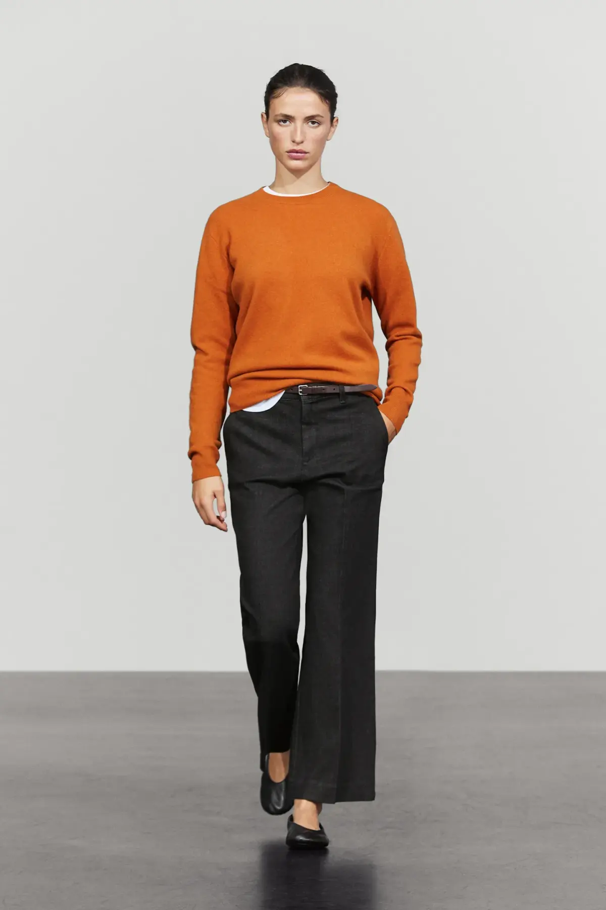
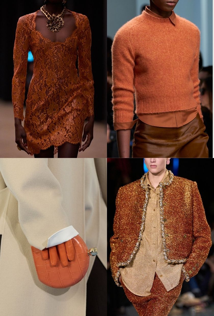
While rich wine tones and burgundy shades have dominated cold-weather collections for several consecutive seasons, fashion writer Ava Gilchrist is opting for a sharper contrast. "As much as I love a glass of Chianti when the weather drops, wearing wine tones is a different story entirely," notes Gilchrist. Instead of investing further in burgundy, she is turning toward piquant oranges, influenced by recent cultural touchstones and the autumnal vibrancy of pumpkin-inspired shades. From tangerine satin shirts to clementine-colored scarves, these warmer, zestier hues are stepping into the spotlight.
Wearing: Espresso
Pausing: Plum
Navigating the spectrum of purples requires a delicate balance, particularly for minimalists who prefer understated tones. Editor Maxine Eggenberger points out that while bright purple is enjoying a major moment across street style and editorial boards, intermediate shades like plum find themselves sidelined in favor of something more foundational. Rather than leaning into muted purples, Eggenberger is sticking to the rich browns of espresso that have anchored her wardrobe successfully, offering a sleek alternative to brighter statements.
Wearing: Sea Glass
Pausing: Red
Cherry red has enjoyed such an extended run at the forefront of fashion trends that it has practically transformed into a functional neutral for many editors. However, shopping editor Florrie Alexander suggests that for a minimalist aesthetic, cherry red can occasionally feel overwhelming within a pared-back closet. For winter 2026, Alexander is turning toward softer sea moss and sea glass hues. These lighter green tones offer a refreshing departure while seamlessly integrating with the black, cream, and chocolate brown foundations that define her seasonal outfits.
Wearing: Royal Purple
Pausing: Orange
In a direct stylistic counterpoint within the office, fashion editor Remy Farrell is embracing the high-impact energy of royal purple while actively stepping back from pumpkin-spice shades. "It’s the Halloween pumpkin spiceness of it—of all the colours in the spectrum, it’s probably the only one I don’t own and, if I dare say, a little on the nose for autumn for my sensibilities," Farrell remarks. By contrast, royal purple offers a vibrant statement that commands attention, serving as an instant confidence booster on the dreariest winter days.
Wearing: Midnight Blue
Pausing: Black
While black remains the undisputed king of timeless style, senior shopping editor Marina Avraam is seeking a subtle evolution for her cold-weather lineup. Growing weary of relying exclusively on stark black ensembles, Avraam is pivoting toward midnight blue. This deep navy hue provides a sophisticated distinction from standard all-black outfits, pairing effortlessly with both neutrals and bold patterns while projecting an elevated look across every price point.