
In a contemporary design landscape heavily dominated by an endless stream of beige, greige, and oatmeal, vibrant and color-rich spaces are increasingly emerging as a welcome and refreshing relief. More and more homeowners are looking past the safety of neutral palettes and are actively embracing what seasoned maximalists have been championing for years. Chief among them is AD100 interior designer Corey Damen Jenkins, who has long argued that color does much more than simply catch the eye. According to Jenkins, not only does a well-chosen palette prompt a profound emotional response, but when applied with precision and intent, it can achieve the exact same calming, soothing effect that manufacturers and traditionalists claim is exclusive to safe neutrals.
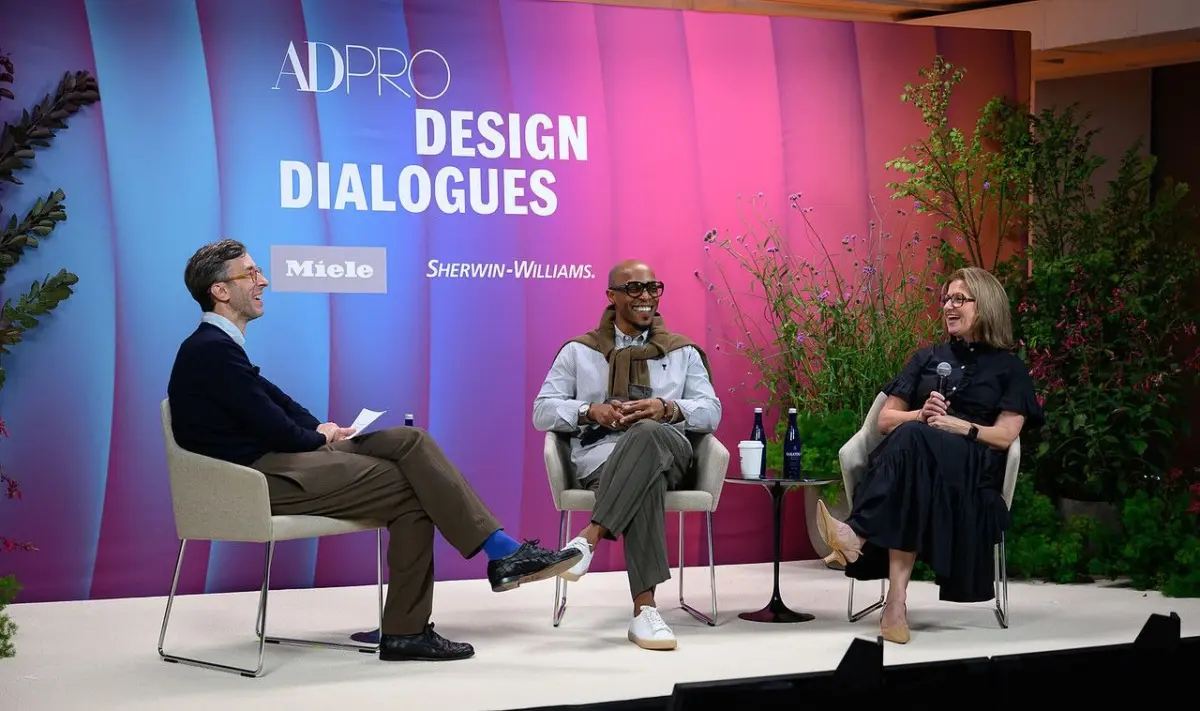
This shifting design paradigm took center stage during a compelling conversation at the AD PRO Design Dialogues summit. Sitting down with Architectural Digest’s Global Features Director Sam Cochran and Sue Wadden, the Director of Color Marketing at leading paint manufacturer Sherwin-Williams, Jenkins dove deep into why color has firmly established itself as the defining hallmark of his high-end residential practice. More importantly, the panel addressed the practical side of interior design: specifically, how professionals can successfully convince hesitant, trepidatious clients to shed their fear of the unknown and embrace the transformative power of a bold, saturated palette.
Color Helps Interiors Get Personal
The modern residential market is defined by an overwhelming desire for individuality. This year, designers are reporting that virtually every homeowner is requesting spaces that feel deeply personalized, steering far away from cookie-cutter aesthetics. Color has quickly proven to be an essential tool for executing this kind of intimate storytelling.
During the summit, Jenkins emphasized that adhering strictly to rigid design rules often stifles creativity, whereas understanding core color principles opens up entirely new avenues for personal expression. Pointing to his own maximalist residence located on Manhattan’s Upper East Side—a masterclass in fearless design where his husband’s treasured navy blue sofa coexists harmoniously with rich accents of red, green, rich browns, and other saturated jewel tones—Jenkins noted that the secret lies in coherence rather than matching. Not everything within a room has to match, he explained, but the overall composition has to flow naturally. By leveraging color thoughtfully, Jenkins is able to tailor his clients’ homes around their unique daily needs, personal art collections, and individual personalities, entirely bypassing fleeting commercial trends.
To maintain his own fearlessness when working with complex, multi-layered color palettes, Jenkins frequently looks backward to find inspiration in the annals of decorative arts history. He draws continuous conviction from the legendary work of pioneering design icons such as Mario Buatta, Billy Baldwin, Mark Hampton, and Jamie Drake, whose collective mastery of color continues to influence contemporary maximalism.
For Hesitant Clients, Start with a Small Space
Despite the growing appetite for expressive interiors, transitioning away from a neutral baseline can be daunting for the uninitiated. Not every client is immediately ready to take the plunge into high-impact design. According to Sue Wadden of Sherwin-Williams, homeowners often find themselves paralyzed by the sheer volume of choices available on the market, leading directly to a general lack of confidence when selecting paint and materials.

To successfully coax wavering clients out of their comfort zones, Wadden and Jenkins recommend starting on a smaller, more manageable scale. An intimately scaled room—such as a powder room, a cozy study, or a small vestibule—presented in a daring, saturated color offers an ideal opportunity to make an oversized design impact. It acts as an invitation, enticing guests step by step into a mysterious little world created specifically for that environment, as Jenkins describes it.
Jenkins often delivers a straightforward reality check to hesitant homeowners, reminding them that life is simply too short to spend it living inside a metaphorical beige box, and that they should stop worrying about the potential judgment of others. For clients who find intricate patterns or heavy wallpaper too intimidating at first glance, starting with a simple, solid coat of paint provides a low-stakes entry point into the world of chromatic design. Wadden noted that while a bold color palette might not be an owner’s first instinct, it serves as a designated playground where they can experiment safely. Because paint acts as an accessible testing ground, it remains remarkably easy to alter if preferences shift over time.
Balance Is Key to Color Success
The transition into maximalism or heavy color usage does not mean abandoning all structural logic. The ultimate secret to utilizing vibrant colors successfully within a residential space lies in manufacturing what Jenkins refers to as "contrasting energy" within the room. This involves carefully selecting a commanding dominant color and layering in other strategic moments of contrasting color, or introducing subtle tonal variations to keep the eye moving.
Determining the exact boundary between a brilliantly layered space and an overwhelming environment ultimately comes down to intuition. When asked how a designer knows if they have pushed a palette too far, Jenkins explained that the realization is deeply emotional. The finest examples of maximalism are never chaotic by accident; rather, they are strictly governed by intentional restraint. All of the great designers throughout history, he noted, inherently understood when it was time to put down the brush and stop.
As the conversation at the AD PRO Design Dialogues summit underscored, the modern appetite for color is not merely a passing stylistic phase, but a deliberate move toward more authentic, expressive living spaces. Whether through the bold maximalist vision championed by practitioners like Corey Damen Jenkins or the accessible, low-risk experimentation encouraged by color authorities like Sherwin-Williams, the industry is signaling that the era of the default neutral box is steadily making room for something far more vibrant.